
Bridges Homeward
Naming Strategy, Brand Identity + Website
Project Overview
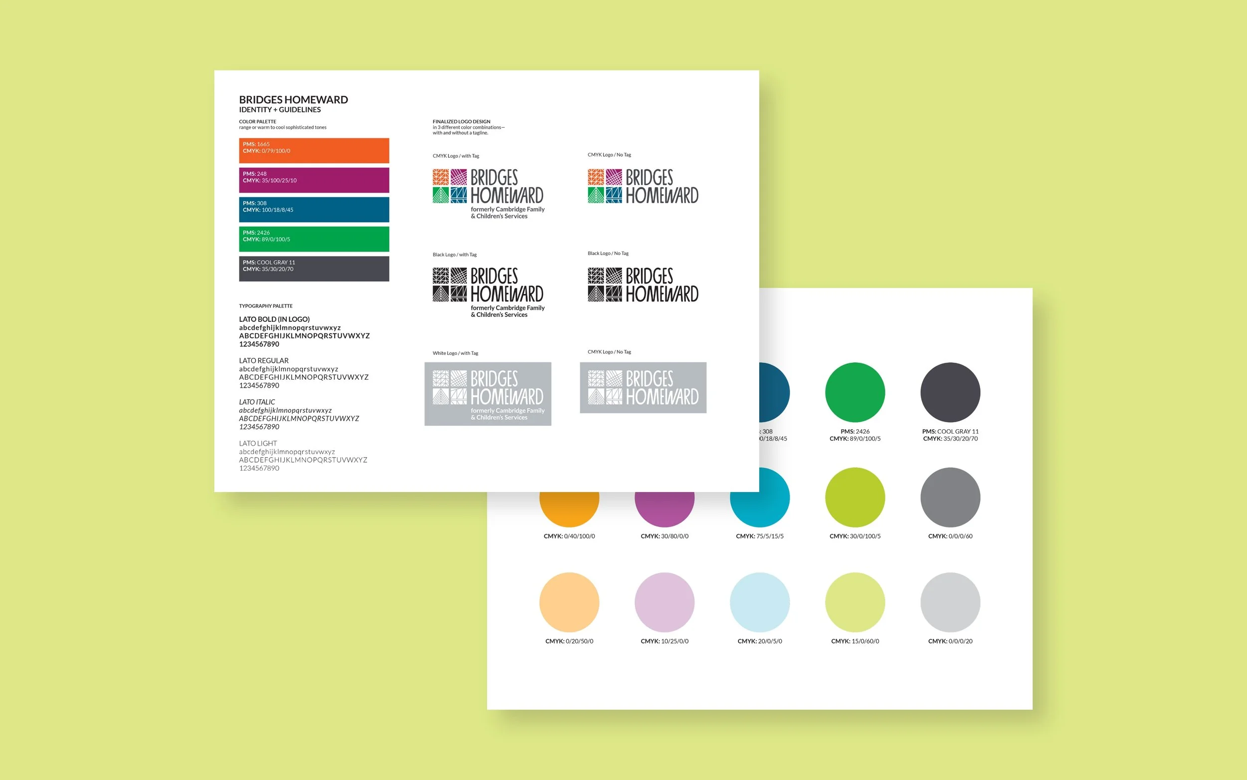
Bridges Homeward is an organization founded in 1874 as an orphanage, growing into a non-profit running five different programs across Massachusetts that advocate for children, teens, and families. goodgood's work initiated with a naming process, as Cambridge was a part of their previous name, but their work extended far beyond Cambridge. Their new name signifies how the organization helps children and families get home — realizing the importance of a home — however that is defined, and finding permanence in their lives. We then developed a logo that reflects the many types of bridges that may lead one home.
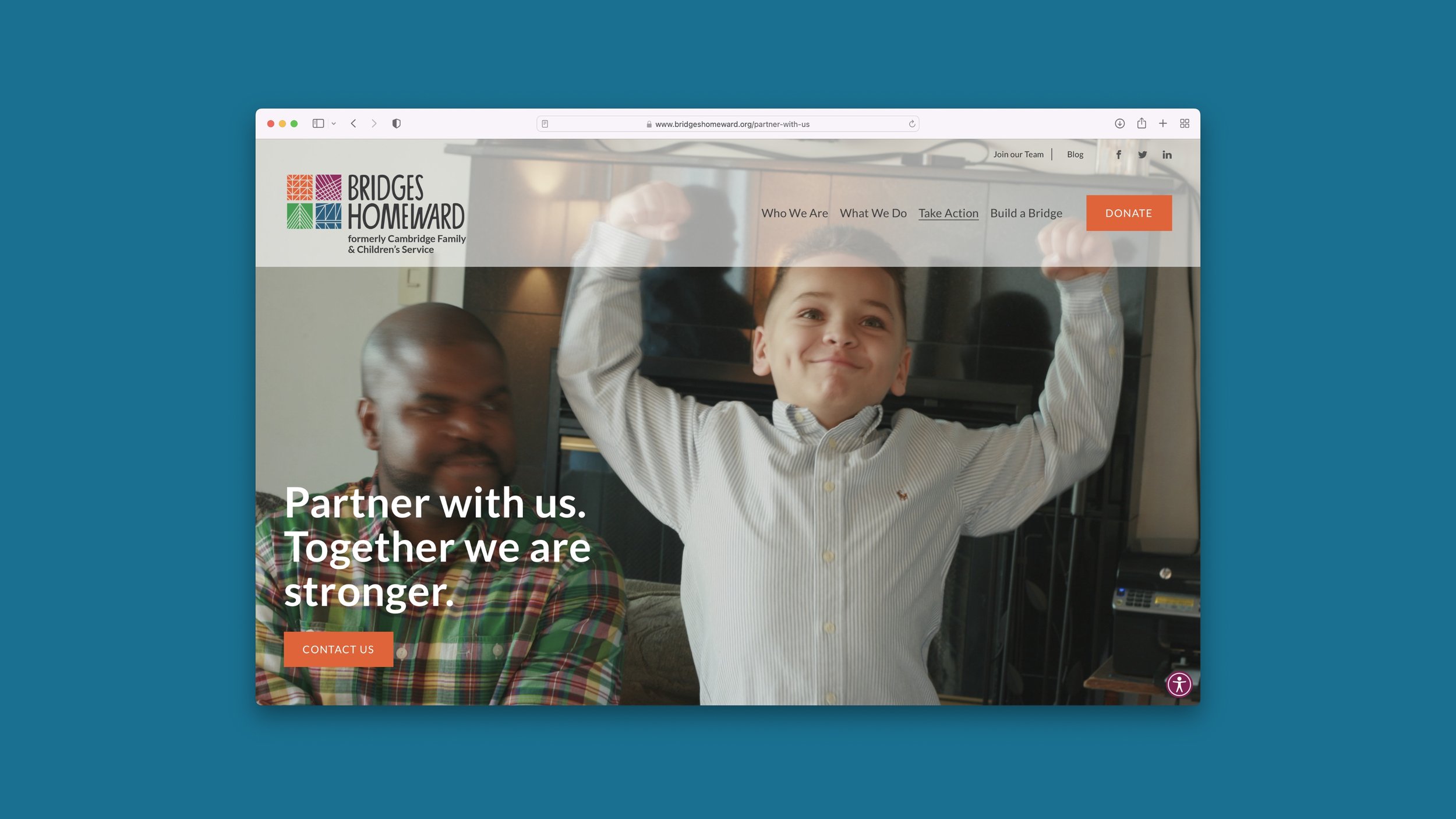
From there, we designed a website focusing on Bridges Homeward's good work. The site architecture more easily allows visitors to see all the hard work that Bridges Homeward does in a way that is clearly organized. We incorporated photography reflecting the children and families impacted by their work in a way that is moving and tells many stories. We also defined the tagline, "Finding Family Everywhere" which shapes every aspect of the brand, as this is at the core of what they do.
LOCATION: Cambridge, MASERVICES: Naming, Brand Strategy, Logo Design, Brand Identity, Website Design, Image + Art Direction


CREDITSPROJECT TEAM
Karen Stein
Alicia Mason-Guild
COLLABORATORS
Mary Mihelic